Your Dashboard Missed This: How AI Finds the Relationships Your Dashboard Can't See
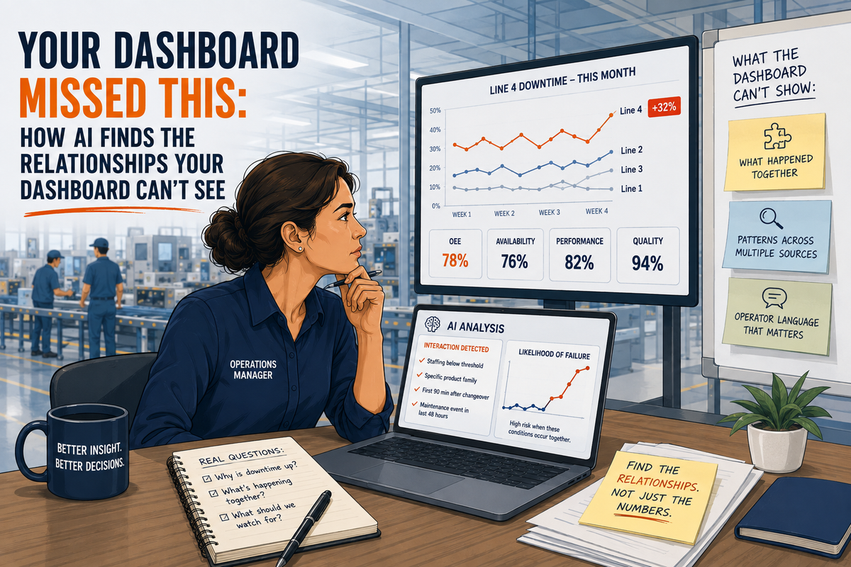
Your KPI dashboard just told you Line 4's downtime jumped again this month. It's sitting right there in red, an unmissable spike above every other line on the report.
What it won't tell you is why.
Not because the data isn't there.
Because your dashboard was never built to look for that kind of answer.
Last time, we set the bar for this series: what can you do with AI that used to take more time, more expertise, or another person entirely? If you missed it, catch up here. [LINK: The Daily Constraint series introduction]
This time, we test that bar against the tool already on your desk. The dashboard you check every morning, before your coffee's even gone cold.
Your Dashboard Was Built to Answer One Question at a Time
Most operational dashboards are counting machines. Here's what they do:
● Total up downtime by cause.
● Plot a Pareto chart.
● Rank your worst offenders.
● Hand you a number.
That's genuinely useful. It's also missing something big. Collapsing a shift's worth of events into a single number throws away the order, the timing, and the combination those events happened in.
One recent analysis put it plainly: a dashboard can report 78 percent OEE. A supervisor on the floor knows the line has really been running closer to 60 percent, for three days straight. The loss never got logged as a discrete event.
The dashboard isn't lying on purpose. It's just answering the question it was built to answer. That's rarely the question you actually have.
Your dashboard shows you what happened. It was never built to show you what happened together.
The Interaction Effect Your Dashboard Can't See
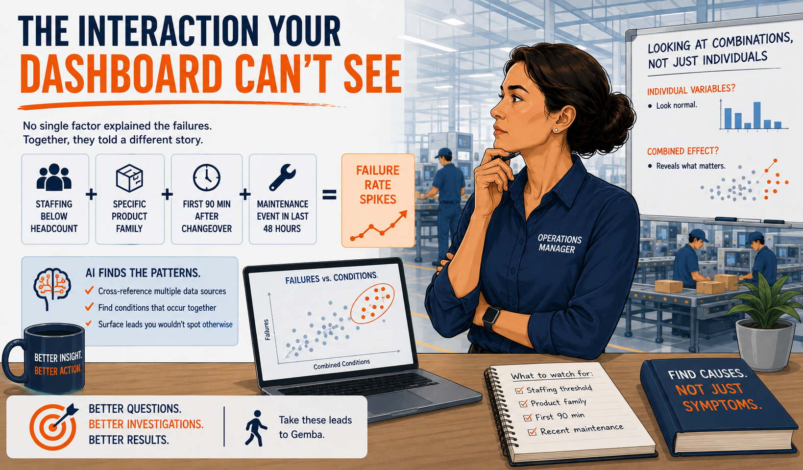
Here's what that looks like on a real floor. Line 4's downtime is high. You've checked the usual suspects.
Staffing levels alone don't explain it. Changeovers alone don't explain it. No single maintenance category jumps off the page. Every individual variable looks unremarkable.
But give AI several weeks of timestamped production, downtime, staffing, changeover, quality, and maintenance data. Ask it to look for combinations instead of single causes.
A different picture can emerge. Maybe the failure rate only spikes when several conditions stack at once:
● Staffing drops below a specific headcount,
● on a specific product family,
● within the first ninety minutes after a changeover,
● and a maintenance event happened on that line within the previous forty-eight hours.
None of those four conditions alone predicts a failure. Stacked together, they might predict most of them.
That's an interaction effect. It's exactly the kind of pattern a dashboard built around single-variable totals will never surface. Nobody built it to cross-reference four data sources against each other at once.
AI, pointed at the right combined dataset, can.
That's the shift worth sitting with.
Not “AI can build me a report.” Any dashboard already does that.
“Can AI find the specific combination of conditions that predicts a failure, so I know what to watch for instead of what already happened?”
The Same Failure, Five Different Names
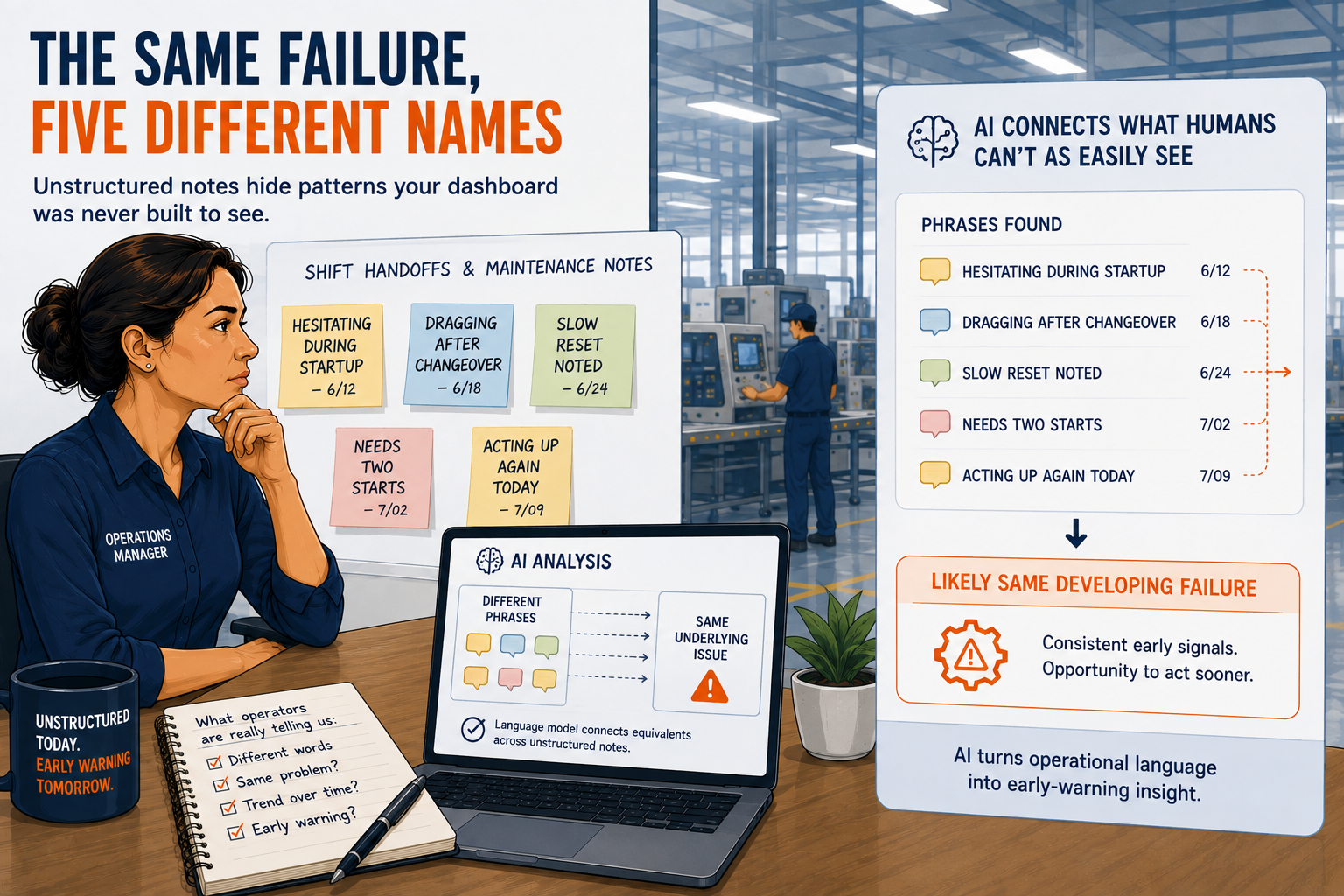
There's a second blind spot. It's not numeric at all.
It's sitting in your shift handoffs and maintenance notes, written in plain language that a spreadsheet can't parse.
Say you pull six months of those notes. Buried in there, operators have described what's probably the same developing failure in five different ways: hesitating, dragging, slow reset, needs two starts, acting up again.
A conventional report doesn't know those five phrases might be pointing at the same emerging problem. It just sees five unrelated comments, if it registers them at all.
A language model, pointed at that same pile of notes and asked the right question, potentially can connect them. This isn't a hypothetical.
Researchers studying maintenance records have found that natural language processing can make sense of writing like that. Rushed, jargon-heavy fragments jotted down between tasks. Not the clean textbook sentences most NLP demos use.
That's the real move here.
Not “AI can summarize your shift notes.” That's table stakes at this point.
“Can AI turn unstructured operational language into an early-warning signal you'd otherwise never see coming?” That's a genuinely different, more useful question.
How to Tell a Real Lead from Noise
Here's the part that matters most. It's also the part AI will not do for you: deciding whether a pattern is worth investigating, or just noise.
Feed AI enough variables across a wide enough time window. It will find patterns.
Some of them will be real. Some of them will be coincidence dressed up as insight. The kind of thing you get when ice cream sales and shark attacks move together, because both peak in summer.
You already know correlation isn't causation. Everyone does. Right up until a deadline's breathing down their neck, and a clean-looking chart starts to feel like an answer.
The difference matters here, with real stakes attached.
A pattern found in three weeks of data, from one line, during one product run, is a hypothesis. A pattern that holds up across multiple lines, multiple shifts, and multiple weeks is a lead worth walking the floor for.
Before you act on anything AI hands you, run it through a short gut check:
● How much data supports this pattern? A handful of instances isn't a trend. It's an anecdote with a chart attached.
● Does it hold up outside the window you tested? Check a different week, a different shift, a different line running the same product.
● Is there a mechanism, or just a coincidence? You know your floor. Does the explanation make physical sense, or is it a statistical accident wearing a lab coat?
● What's missing? Ask what data would prove this wrong, not just what data supports it. A lead that survives that question is worth your time.
This is the part of the job AI cannot take from you. It honestly shouldn't.
Your floor knowledge is what turns a statistical pattern into a real investigative lead. AI just gets you to the pattern faster than six hours of pivot tables would have.
The Prompt: Run This Against Your Own Data
This works best with a tool that can read and analyze files, not just chat: Claude, ChatGPT with data analysis enabled, or similar. Pull together whatever timestamped data you have access to. Even a partial set is worth running. Then adapt this prompt to your situation.
1. Set the Context
● Tell it what kind of operation this is: line, cell, or department.
● Name the product or products running through it, and the time window your data covers.
● Name the specific problem you're chasing: recurring downtime, a quality escape pattern, unexplained cycle time drift.
2. Give It the Data, and Be Specific About Format
● Upload or paste your production, downtime, staffing, changeover, quality, and maintenance data.
● Tell it which columns are timestamps, which are categorical (shift, product family, downtime reason code), and which are numeric.
3. Ask for Interactions, Not Just Totals
● Don't let it just rank the biggest downtime categories.
● Ask it to look for combinations of two or more variables that predict a problem better than any single variable alone.
● Ask it to test whether those combinations hold up across more than one time period.
● Example instruction: “Don't just tell me the largest downtime category. Look for conditions that, combined, predict failures or downtime spikes better than any single variable alone. Test whether each pattern holds across at least two separate weeks before reporting it.”
4. Include the Qualitative Notes Separately
● If you have shift handoff or maintenance notes, ask it to read through them.
● Ask it to group entries that describe the same underlying issue in different words.
● Flag any cluster that shows up more than a handful of times.
5. Force It to Rate Its Own Confidence
● Ask for a ranked list of findings.
● For each one: the sample size behind it, whether it held up across more than one time window, and a plain-language explanation of why it might be real versus coincidental.
6. Ask What It Can't Tell You
● Close by asking what additional data would make each finding more or less credible.
● This tells you where to look next, instead of leaving you with a list of claims to take on faith.
Run through all six, and you'll have a short list of real leads instead of a hunch.
What AI Can't Confirm for You
It doesn't replace walking the floor. A pattern in the data still needs a pair of eyes on the actual machine, the actual crew, the actual changeover, before you spend money acting on it.
AI can narrow six weeks of investigation down to a short list of real leads. It can't confirm any of them for you.
What it does is remove the constraint that used to sit between a good question and a real answer. That constraint used to be the time it takes to cross-reference five data sources by hand. Or the analyst you'd otherwise wait three weeks for.
Next Up in the Series
You've got a short list of leads now. Ranked and sourced.
Next up, we take the strongest one and build it into something more rigorous than another 5 Whys session. A hypothesis matrix that holds several suspects at once, and forces AI to help you rule them out systematically instead of settling on the first plausible story. [LINK: The 5 Whys Are Broken: How AI Helps You Track Multiple Root Causes]
Subscribe to The Daily Constraint. It'll land in your inbox the day it goes live.
Run this prompt against your own data? Comment below. Tell me what it found. Not whether it impressed you. Whether it gave you something worth walking the floor to check.